This is quick and dirty code that tries to reproduce the analysis and graph from the post: “Per capita consumption of mozzarella cheese (US) correlates with Civil engineering doctorates awarded (US)”
 1 # get the data from the article
 2 library(XML)
 3 url <- "http://www.tylervigen.com/view_correlation?id=3890"
 4 tables <- readHTMLTable(url)
 5 # we need table 3, minus a couple of extra columns
 6 tab3 <- tables[[3]][1:2,-c(1,12)]
 7 years <- as.numeric(colnames(tab3))
 8 # per capita consumption of mozzarella
 9 cheese <- as.numeric(t(tab3)[,1])
10 # civil engineering doctorates
11 engdoc <-as.numeric(t(tab3)[,2])
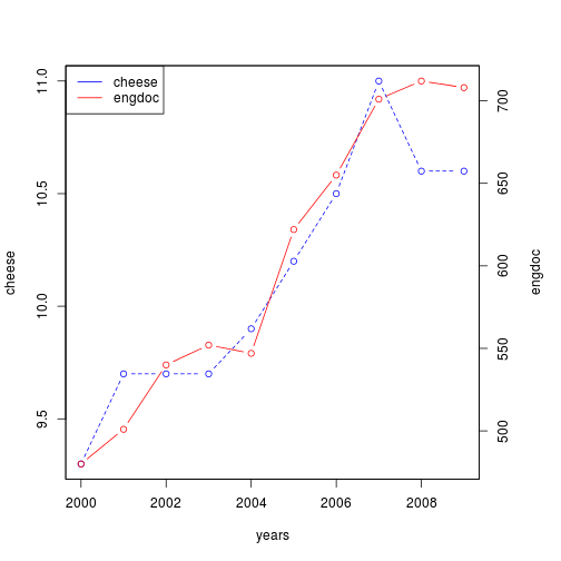
Now we will reproduce the plot
1 # code stolen+adapted from http://robjhyndman.com/hyndsight/r-graph-with-two-y-axes/
2 par(mar=c(5,4,4,5)+.1)
3 plot(years, cheese, type="b", lty="dashed", col="blue")
4 par(new=TRUE)
5 plot(years, engdoc, type="b", col="red",xaxt="n",yaxt="n",xlab="",ylab="")
6 axis(4)
7 mtext("engdoc",side=4,line=3)
8 legend("topleft",col=c("blue","red"),lty=1,legend=c("cheese","engdoc"))
And calculate the correlation (which happens to be high)
# calculate the correlation
cor(cheese, engdoc)
## [1] 0.9586
This bit was made to answer a question from a friend (Hi César!), and originally was published as a gist: https://gist.github.com/jmcastagnetto/59c26c2624e621a13582