We will use the list of Presidents of Peru from a Wikipedia page, to play a bit with some cool R packages (XML, dplyr, lubridate, ggplot2, and googleVis), which will be used to extract and clean up the data, and later make some summaries and plots.
Requirements
For this experiment, we will need the following libraries
- XML: to parse and extract a table from an HTML page
- dplyr: to do some data manipulation
- lubridate: to do some date operations
- ggplot2: to generate a nice boxplot
- googleVis: to make some interactive tables and plots (I am using the development version from github)
1 require(XML)
2 require(dplyr)
3 require(lubridate)
4 require(ggplot2)
5 require(googleVis)
If you don’t have them installed, then you might want to run:
1 install.packages(c("XML", "dplyr", "lubridate", "ggplot2"))
2 # pre-requisites for the development version of googleVis
3 install.packages(c("devtools","RJSONIO", "knitr", "shiny", "httpuv"))
4 devtools::install_github("mages/googleVis")
Getting and mangling the data
First, let’s read the data from the third HTML table in Wikipedia’s page: “List of Presidents of Peru”
1 src <- "http://en.wikipedia.org/wiki/List_of_Presidents_of_Peru"
2 doc = htmlParse(src, encoding = "UTF-8")
3 tables <- readHTMLTable(doc)
4 # the table we need is the third one
5 t3 <- tables[[3]]
Then, we ought to fix some weirdness in the data, and will save it to a CSV just in case we want to do some more processing in the future. As we are keeping the original column names from the HTML table, some code is a bit more cumbersome (because we need to use backticks).
 1 # We do not need column #2, which contains an image
 2 # also, let's reorder the columns
 3 t3 <- t3[,c(3,6,7,4,5)]
 4
 5 # convert to dates the start and end term columns
 6 fix_date <- function(x) {
 7     return(as.Date(strptime(x, format="%B %e, %Y")))
 8 }
 9 t3[c("Inaugurated","Left office")] <- lapply(t3[c("Inaugurated","Left office")], fix_date)
10
11 # cleanup random stuff in []s in a couple of columns
12 t3$`Form of entry` <- sub("\\[7\\]", "", gsub("\n", " - ", t3$`Form of entry`))
13 t3$President <- gsub("\\[.+\\]", "", as.character(t3$President))
14
15 # add the regular end of term (5 yrs) for the current president
16 last <- nrow(t3)
17 if (is.na(t3[last,]$`Left office`)) {
18   tmp <- t3[last,]$Inaugurated
19   year(tmp) <- year(tmp) + 5  # normal presidential term: 5 years
20   t3[last,]$`Left office` <- tmp
21 }
Displaying the data as a sortable and paginated table
Let’s look at the data we got after scraping Wikipedia and mangling values around. We’ll make an interactive table using the gvisTable function from the googleVis package.
We want to paginate the table, because Peru has had 97 people that held the Presidency at one point or another. The table is a bit wide, so it will look nicer.
1 opts <- list(width=800, height=330, showRowNumber=TRUE, page="enable")
2 presidents_table <- gvisTable(t3, options=opts)
3 print(presidents_table, "chart")
Creating a timeline chart
Now, let’s visualize the succession of presidents using a timeline chart as implemented in googleVis, coloring each timespan by the what original data calls “Form of entry”, which is how a particular person got into the Presidency. There are 3 records that do not have a given value for the aforementioned field, so we will recode those as “Unknown”.
This chart is also a bit wide, because the data spans over 190 years.
1 t3[t3[, 2] == "", 2] <- "Unkown"
2 presidents_timeline <- gvisTimeline(
3     t3, rowlabel="President", start="Inaugurated", end="Left office",
4     barlabel="Form of entry", options=list(height=500, width=800))
5 print(presidents_timeline, "chart")
You might have noticed that at some points in Peru’s history we had more than one President, and at other times they seem to change rapidly or to swing back and forth among a number of recurring characters. Such was our lot back then, but we have had better luck for some decades now.
Understanding how they got into power
We will make cummulative frequency chart, by using dplyr to manipulate and summarize the data and googleVis to plot it. We could’ve used table() along with other base functions, but dplyr’s syntax is cleaner and more readable.
 1 # group by "Form of entry", get the counts per group, and sort the
 2 # data frame in descending order of counts
 3 t3_summary <- t3 %>% group_by("Form of entry") %>%
 4     summarise(count=n()) %>%
 5     arrange(-count, `Form of entry`) %>%
 6     mutate(`Cummulative frequency`=round(100*cumsum(count)/sum(count),2))
 7
 8 # make the cummulative frequency chart and print it
 9 t3_summary_chart <- gvisLineChart(
10     t3_summary, xvar="Form of entry", yvar="Cummulative frequency",
11     options=list(height=400, width=800, pointSize=5,
12                  title="How peruvian presidents got into office",
13                  vAxis="{title:'Cummulative frequency (%)'}",
14                  hAxis="{title:'Mode of attaining office'}",
15                  legend="{position:'none'}")
16     )
17 print(t3_summary_chart, "chart")
In this chart we can plainly see that the first 4 modes of attaining office (”Direct Elections”, “Coup d’état”, “Interim caretaker”, and “Elected by Congress”), comprise the majority (a bit over 81%) of all the ways that the office of President have ever been attained in Peru.
Length of time in office
If we wanted to know the distribution of the lengths of time in office for all presidents, we can do some simple data exploration and create a histogram, with the the median and mean overlayed on it:
 1 # length of time in office
 2 lio_days <- as.numeric(t3$`Left office` - t3$Inaugurated + 1)  # in days
 3 lio_yrs <- lio_days / 365.25   # in years
 4 lio_yrs_mean <- round(mean(lio_yrs),2)
 5 lio_yrs_median <- round(median(lio_yrs),2)
 6 hist(lio_yrs, main="Distribution of time in office", xlab="Time span (years)")
 7 abline(v=lio_yrs_mean, col="red", lwd=2, lty="dashed")
 8 abline(v=lio_yrs_median, col="blue", lwd=2, lty="dashed")
 9 text(x=c(lio_yrs_mean+.1, lio_yrs_median+.1), y=c(25,45),
10      labels=c(paste0("Mean=", lio_yrs_mean), paste0("Median=", lio_yrs_median)),
11      pos=4, col=c("red", "blue"))
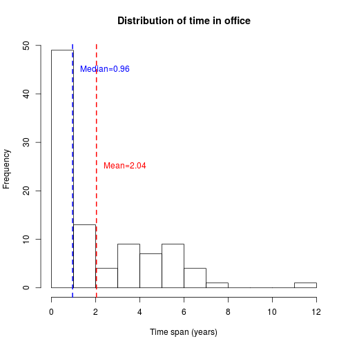
We can see a typical right-skewed distribution, with a great majority of short lengths of term in office (as little as 2 days), and some exceptionally long ones (as much as ~11.15 years). So in this case, the mean (2.04 years) is not very informative, and the median (0.96 years) looks suspiciosly short.
Let’s look at these time spans groupíng them by the way each one attained the office.
 1 t3$len_office <- lio_yrs
 2 # generate a grouping variable based on the form of entry
 3 t3$group <- gsub("^([^-]+) -(.*)", "\\1", t3[,"Form of entry"], fixed=FALSE)
 4 # combine the forms of entry with counts less than 10
 5 tg <- table(t3$group)
 6 otherlvl <- names(tg[tg < 10])
 7 t3[t3$group %in% otherlvl,]$group <- "Other"
 8 # reorder the grouping column by increasing count
 9 tg <- table(t3$group)
10 t3$group <- factor(as.character(t3$group), levels=names(tg[order(tg)]))
11 # Make boxplots for each grouping factor
12 t3_plot <- ggplot(t3, aes(group, len_office)) +
13     geom_hline(yintercept=5, colour="gray", linetype="longdash") +
14     geom_boxplot(aes(colour=group)) +
15     ggtitle("Distributions of Peruvian President's terms in office") +
16     coord_flip() + ylab("Length in office (years)") + xlab("How office was attained") +
17     theme_bw() + theme(legend.position="none")
18 t3_plot
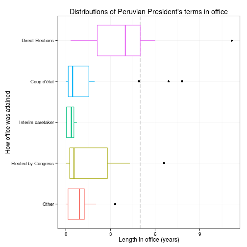
In this chart we have added a reference line, the official time span for a President’s term in office in Peru: 5 years. It would seem that if you got into office by “Direct Elections” you have a better chance to reach you usual term (median ~ 4 years), but if you got by another route (let’s say by “Coup d’état”) you are more likely to be there for a short time.
In the table below, we can see a set of summary statistics per group, which indicate a distinctive difference between them.
1 t3_grouped <- t3 %>% group_by(group) %>%
2     summarise(n=n(), avg=mean(len_office), sd=sd(len_office), median=median(len_office),
3               min=min(len_office), max=max(len_office), iqr=IQR(len_office)) %>%
4     arrange(-n)
5 t3_grouped[-1] <- sapply(t3_grouped[-1], function (x) { round(x,3) })
6 t3_grouped_table <- gvisTable(t3_grouped,
7                               options=list(width=800, height=200))
8 print(t3_grouped_table, "chart")
In fact, using a Kruskal-Walis rank sum test, seems to indicate that the groups are indeed different (p < 0.001).
1 kruskal.test(len_office ~ group, data=t3)
	Kruskal-Wallis rank sum test

data:  len_office by group
Kruskal-Wallis chi-squared = 38.46, df = 4, p-value = 8.997e-08
There might be a moral in this data, but policital conclusions run the risk of degenerating in random rants, so I’ll skip that.
Reproducibility information
The source code for this document is available at https://gist.github.com/jmcastagnetto/11127154
This post was originally published in RPubs at
http://rpubs.com/jesuscastagnetto/peru-presidents.
This version contains syntax changes, because in current versions of dplyr the
“piping” operator is now %>%
sessionInfo()
R version 3.1.1 (2014-07-10)
Platform: x86_64-pc-linux-gnu (64-bit)

locale:
 [1] LC_CTYPE=en_US.UTF-8       LC_NUMERIC=C
 [3] LC_TIME=en_US.UTF-8        LC_COLLATE=en_US.UTF-8
 [5] LC_MONETARY=en_US.UTF-8    LC_MESSAGES=en_US.UTF-8
 [7] LC_PAPER=en_US.UTF-8       LC_NAME=C
 [9] LC_ADDRESS=C               LC_TELEPHONE=C
[11] LC_MEASUREMENT=en_US.UTF-8 LC_IDENTIFICATION=C

attached base packages:
[1] methods   stats     graphics  grDevices utils     datasets  base

other attached packages:
[1] googleVis_0.5.2 ggplot2_1.0.0   lubridate_1.3.3 dplyr_0.2
[5] XML_3.98-1.1    knitr_1.6

loaded via a namespace (and not attached):
 [1] assertthat_0.1   colorspace_1.2-2 digest_0.6.4     evaluate_0.5.5
 [5] formatR_0.10     grid_3.1.1       gtable_0.1.2     labeling_0.2
 [9] magrittr_1.0.1   MASS_7.3-33      memoise_0.2.1    munsell_0.4.2
[13] parallel_3.1.1   plyr_1.8.1       proto_0.3-10     Rcpp_0.11.2
[17] reshape2_1.4     RJSONIO_1.2-0.2  scales_0.2.4     stringr_0.6.2
[21] tools_3.1.1